Datahubz
100% of new users got lost on a compliance dashboard. I pivoted the project to fix the entry point, and 100% completed onboarding.
The problem
Datahubz helps small and midsize businesses prepare for compliance frameworks like CMMC, GDPR, SOC 2 and ISO 27001. The people who need it most are founders, office managers and IT staff with no compliance background, and the dashboard assumed knowledge they didn't have.
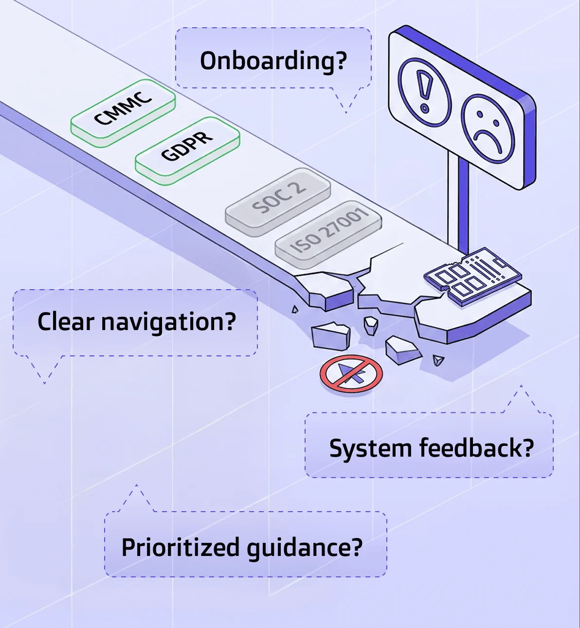
In our first usability round, 100% of new users couldn't tell what to do next, and 60% were confused by compliance terms. One tester put it simply: "I didn't know what I did… I didn't see the result of what I did." Users weren't missing features. They were missing a starting point.
How I worked
Find where users break
Our team ran a heuristic evaluation, benchmarked 5 competitors and ran 5 moderated usability sessions. The same failure showed up every time: no orientation, no system feedback, no clear next step.
Pivot to the front door
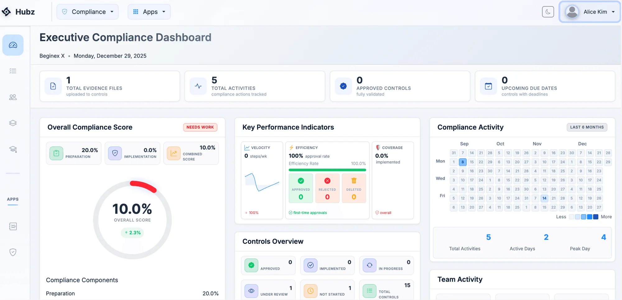
Our brief was the document and evidence workflow, but users never got that far. I recommended to the founder that we fix the dashboard first. It was the root cause, it fit the MVP's need for quick wins, and it needed no new features. The founder approved.
Build guidance into the dashboard
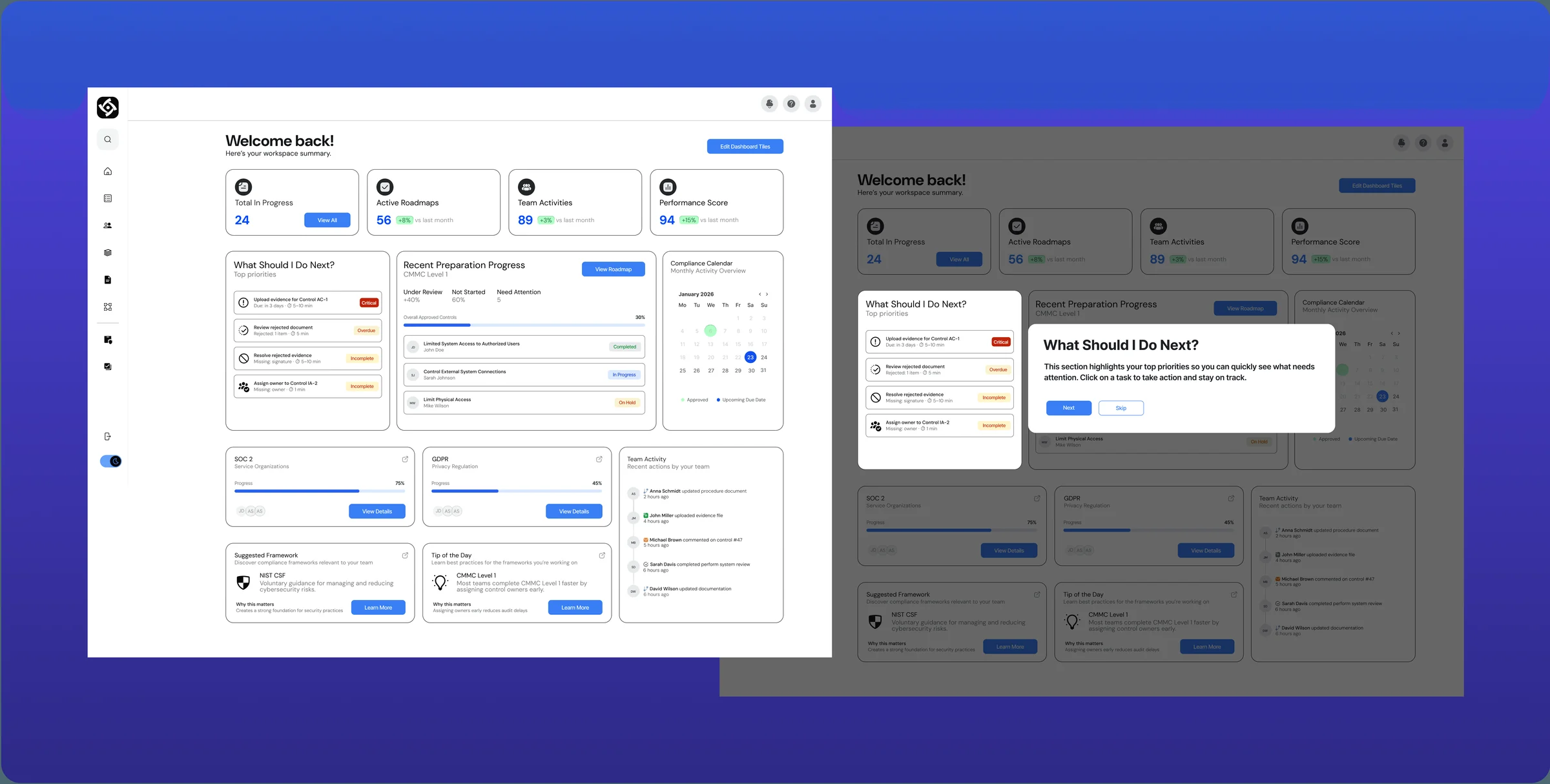
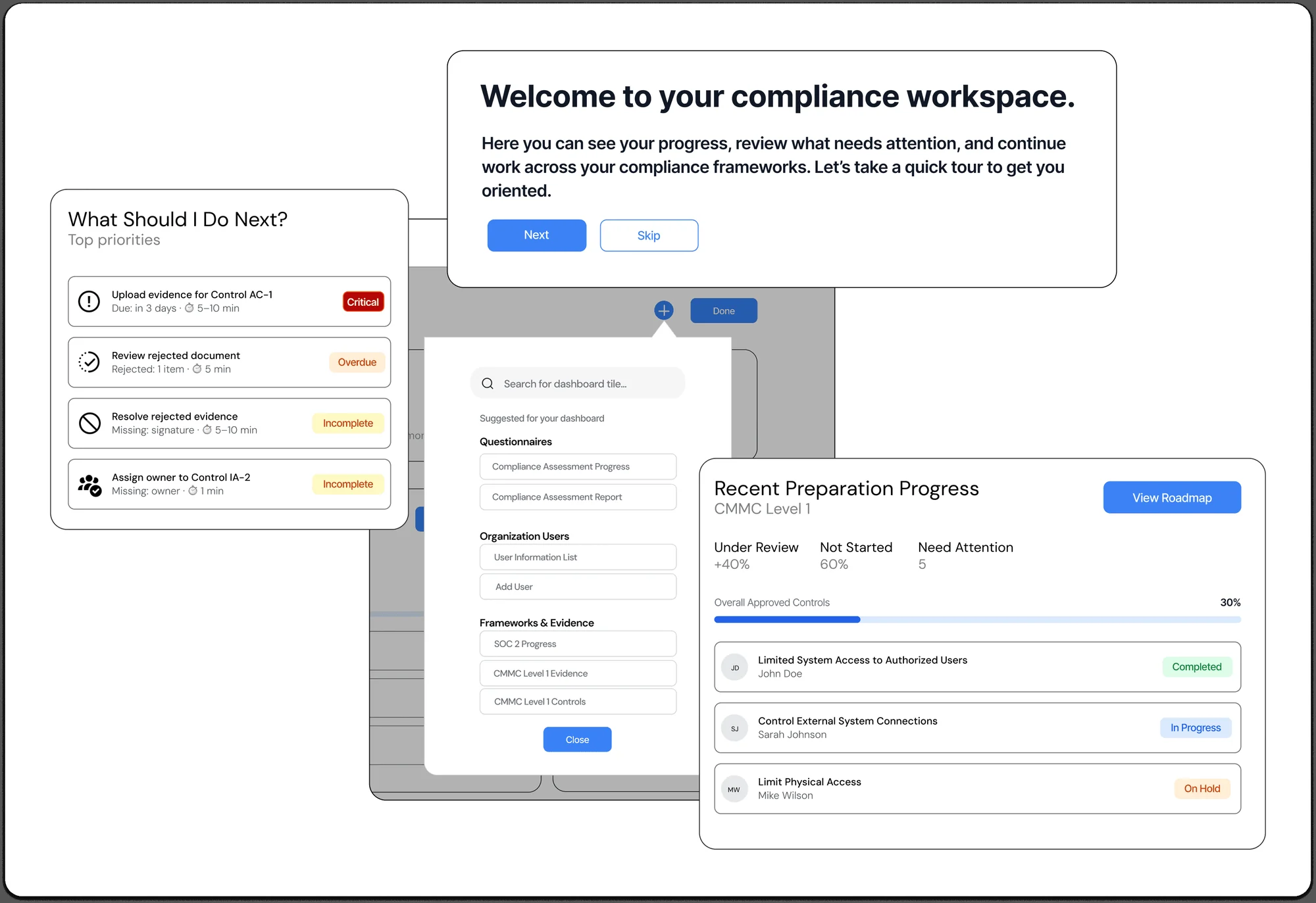
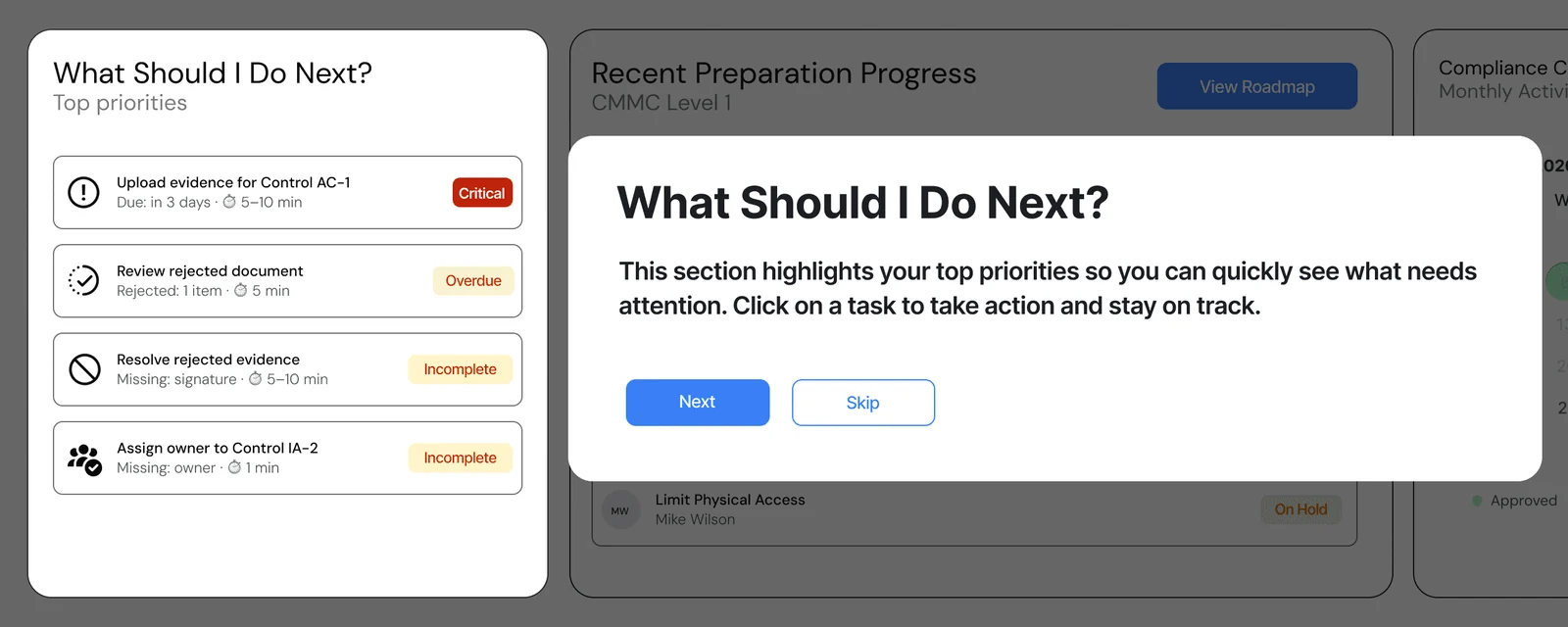
I led the redesign in two layers: a welcome tour with tooltip pop ups that point out each part of the dashboard on the first visit, and guidance built into the dashboard itself, so help is still there after the tour is closed.
Final design
A dashboard that tells users where to start. A "What Should I Do Next?" panel ranks urgent tasks with labels and time estimates, supported by clearer navigation, tooltips on compliance terms and customizable tiles.
Outcome
100%
Of first time testers completed key onboarding tasks (15 unmoderated participants)
57%
Said tooltips and guidance improved their understanding
3/5
Average confidence, which stayed neutral
What I would do differently
Completing a task isn't the same as understanding it. Users finished, but still leaned on trial and error, and that set up the next iteration.
The most valuable call wasn't a design decision. It was knowing when to stop and reframe the scope: when 100% of users fail at the same point, that's a product strategy problem, not a usability one. Next time, I'd write tooltips around what to do, not what a term means, and test with compliance managers under real deadline pressure.
Next case study